Appearance
Intro to the editor
The WeWeb Editor is where you build your projects.
It is made up of 4 sections:
- The top navigation menu
- The canvas in the middle (visible in the
Interfacetab) - The left panel
- The right panel
Topbar
The topbar is where you can:
- Open the top-left menu to go back to your dashboard, open domain settings, or use safe mode
- Switch between the three main tabs:
Interface,Data & API, andSettings - Navigate between changes (undo/redo)
- See who is currently editing the project
- Open
Agentsor enterPreviewmode - Publish the app
Project settings
By clicking the menu icon in the top-left corner, you can:
- View available shortcuts
- Open domain settings (links to the dashboard domain page)
- Navigate back to your dashboard
- Use safe mode (
No workflowsorNo workflows & no formulas) - Switch the editor to light or dark mode
Main editor tabs
The WeWeb editor has three main tabs that you can switch between in the top navigation:
Interface tab
The Interface tab is where you build and design your user interface. This tab provides access to the canvas (the visual workspace) along with its header for page-level controls.
In the Interface tab, you can access:
- Canvas: The visual workspace where you build and preview your interface
- Canvas header: Quick access to page selection, language switching, URL parameters, and device views while editing
- Preview mode: Test your app from the top bar, including switching between pages without leaving Preview
- Left panel tools: Access various panels from the icon sidebar including:
- Add Element: Drag-and-drop native elements, components, and templates onto the canvas
- Pages: Manage pages, routes, and page settings
- Assets: Access UI libraries, icons, fonts, images, and files
- Workflows: Create interface workflows that respond to user actions
- Variables: Create and manage variables for dynamic content
- Formulas: Build custom formulas for data transformation and calculations
- Integrations: Add and configure external services
- Debug: View logs and inspect variable values in real-time
- Development: Access coded components and developer tools
CONTINUE LEARNING
The Interface tab contains all the tools you need to build your user interface:
Data & API tab
The Data & API tab is where you manage your backend and data operations. Here you can access:
- Tables: Create and manage database tables with built-in or external data sources
- Backend Workflows: Build backend workflows (APIs) that run server-side
- Authentication: Configure SSO providers, roles, and auth settings
- Storage: Manage file storage for your backend
- Logs: View backend logs
- Integrations: Add and configure external services (for example Resend, SendGrid, Airtable, Segment, Slack, and more)
Learn more about working with Data & API features.
Settings tab
The Settings tab is where you configure project-level settings and manage your deployment environment. Here you can access:
- Publications: Publish and manage your app versions
- Interface Settings: Configure app languages, PWA options, theme, headers, redirections, and other app-wide interface settings
- Environment Variables: Store API keys and configuration values for different environments
- Editor Backups, Usage, and Monitoring: Track project activity and restore previous versions
TIP
Integrations can be accessed from the Integrations panel in the Interface tab or the Integrations subtab in Data & API. There is no separate top-level Integrations tab.
Canvas (Interface tab)
The canvas is the central workspace in the Interface tab where you build and visualize your application's user interface in real-time.
You can select elements, move them around, and directly edit content:
Canvas header
When working in the Interface tab, the canvas has a header bar that provides quick access to important page-level controls:
The canvas header includes:
- Collapse sidebar — Button to collapse/expand the Left Panel
- Page selection/settings — Change pages or access settings of a specific page
- Language selector — Switch between languages to preview translated content (languages must first be added to your project and enabled on pages)
- URL parameters/paths — View and test URL parameters/paths for the current page. Learn more about the URL Parameters panel
- Refresh — Reload the page
- User display — See which user account you're previewing as and dynamically switch between users (useful when testing role-based access)
- Page Settings — Access the settings for the current page
- Device breakpoint toggles — Quick switch between desktop, tablet, and mobile views
Preview mode
Click Preview in the top bar to see your app as visitors would. While previewing, the page selector stays in the top bar so you can move between pages without exiting Preview.
- Switch pages from the page selector without leaving Preview
- Click the cog on the page selector to open page settings — this exits Preview and opens the
Pagespanel - Click
Add pagein the page selector dropdown to create a page — this also exits Preview
TIP
Language switching is in the canvas header while editing, and in the top bar while previewing. To enable multi-language support, you need to first add languages to your project through the Pages panel in the left sidebar, then enable them on specific pages.
Learn more about managing page languages.
The box model
Crafting layouts in WeWeb revolves around the box model.
Think of every element on your page as a box with four layers:
- The content (like text or images)
- Padding (space inside the box)
- Border (an outline around the padding)
- Margin (space outside the box)
Learn more about the box model →
Responsive design
To help build responsive designs, you can edit and preview the canvas views – desktop, tablet, mobile – and publish when you're ready:
Left panel
The left panel in the WeWeb editor serves as your navigation and organization hub. It consists of two main parts:
Icon sidebar
The icon sidebar provides quick access to all the tools and features available in the current tab. The available icons change depending on which tab you're in (Interface, Data & API, or Settings).
Interface tab icons
When in the Interface tab, the icon sidebar includes:
- Add Element (
+icon) — Drag-and-drop native elements, components, and templates onto the canvas - Pages (document icon) — Manage pages, routes, and page settings
- Assets (shapes icon) — Access UI libraries, icons, fonts, images, and files
- Workflows (lightning bolt icon) — Create interface workflows that respond to user actions
- Variables (variable icon) — Create and manage variables for dynamic content
- Formulas (formula icon) — Build custom formulas for data transformation
- Integrations (puzzle icon) — Add and configure external services
- Debug (bug icon) — View logs and inspect variable values in real-time
- Development (terminal icon) — Access coded components and developer tools
TIP
Pages are managed through the Pages icon in the left panel icon sidebar. You can also switch pages from the page selector in the canvas header while editing, or from the top bar while in Preview mode.
Layout Tree panel
When editing in the Interface tab, the left panel shows the Layout Tree — the element tree for the current page.
Popups are not managed from the layout tree. Use Add Element → Your project → Manage Popups instead.
Layout tree
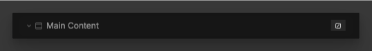
The layout tree shows every element on the page you are currently editing.
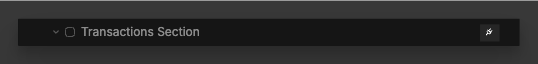
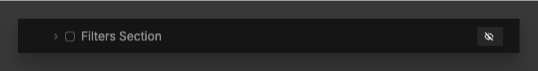
Layout tree icons
To help you quickly understand what's configured on each element, the layout tree shows small icons on the right side.
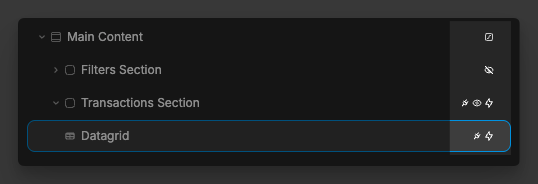
Lightning Bolt Icon — Indicates the element has one or more workflows attached.
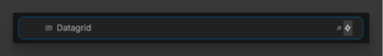
Plug Icon — Indicates the element has data bound to one or more properties (for example, repeat items, text, or a style value).
Eye Icon — Indicates conditional rendering or display logic is set on the element (for example, show/hide based on a condition).
Square Icon — Indicates an animation is configured on the element.
Agents panel
The Agents panel is pinned on the left side of the editor (alongside the icon sidebar). Open it with the Agents button in the top bar, or press Cmd+L on Mac / Ctrl+L on Windows.
Choose WeWeb AI to build inside the editor, or connect an external agent such as Claude, ChatGPT, or Cursor over MCP.
Learn more about WeWeb AI → · Learn more about WeWeb MCP →
Right panel
The panel on the right is the edition panel. It opens when you select an element on the page and gives you precise control over styling, data binding, settings, and workflows for that element.
Right panel (Edit)
The edit mode of the right panel gives you precise control over the element that is selected on the page.
It allows you to:
- Style the element,
- Bind data to the element,
- Change settings that are specific to that type of element,
- Add no-code workflows on the element.
Style
The Style tab is where you change styling properties for the selected element. Many properties also support data binding inline on the same field.
See a full breakdown of all available styling properties
TIP
Whenever you change the styling of an element from the style panel, you are actually changing the CSS of the element
BINDING DATA
You can bind data to almost every property in WeWeb — including style fields and repeat settings — using the bind control on each property.
When you bind repeating, you only see one element in the layout tree, but it renders once per item in the bound list.
Settings
In the Settings tab of the right panel, you can:
- Link to another page or URL on click of the selected element
- Name the selected element
- Add an id, class, or attribute to the HTML of the selected element
- Control whether the scroll position of the selected element is watched
- Set the conditional rendering of the selected element. Learn more about conditional rendering
Workflows
Workflows are core to the logic and functionality of your web applications.
In the Workflows tab of the right panel, you can add new workflows to an element and access all existing workflows on that element:
TIP
Workflows allow you to execute actions when a certain trigger happens on the element, like changing the value of a variable on click.
Learn more about workflows